Unique designs are always a hit with UCF fans
What is money called in space? Star Bucks. Okay, enough with the bad space jokes.
It’s the most wonderful time of the year — Space Game time! Or, if your name is Trace or UCFMike, the worst time of the year…
Last Saturday, the Citronauts (Knights, if you don’t like fun) took the field for their 7th annual space game. “Mission VII,” saw the ‘Nauts wear Canaveral blue uniforms for the first time. After seeing these babies in person, I decided to do a quick look back and give my personal rankings of the seven unique uniforms we’ve seen so far, from “Space U.”
UCF takes special care to design the annual space game uniforms and the process takes almost a full year, from design to completion. We see the finished product when the players take the field, but the planning and development of each space game uniform is something that UCF takes very seriously.
All of the uniforms are great, but here are my personal thoughts, from least to most favorite:
Mission I 2017
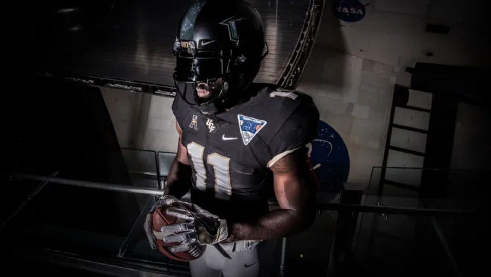
Coming in at number seven, we have the inaugural space game uniforms worn in 2017. Consisting of UCF’s normal black jersey with a space game patch and a black helmet with a moon-inspired UCF stack decal and stripe, these were the first, but also most “bland” of the space game takes, to date. The original is classic, but it only got better from here! Who knew what we’d be seeing from here on out!?
Mission VI 2022
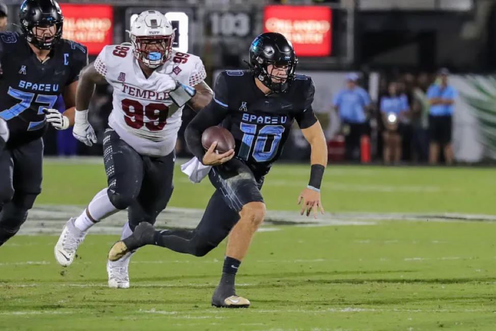
In 2022, UCF gave us the first iteration of “Space U” on a jersey. The Canaveral Blue highlights on the black jerseys really popped. It was also the first time we saw this much blue on a UCF uniform. The blue to black “shine” stack UCF decal on the helmet completed this all-black look. As a night game uniform, these were “out of this world.”
Mission VII 2023

Say it with me: “MORE CANAVERAL BLUE, PLEASE!” In 2023, we saw UCF “boldly go” where it has never gone before, by using an all-blue uniform set paired with a white helmet. Integrating the Pegasus logo into the shoulders with just the “wings” is a unique look. The number font was reflective and matched the white helmets with a simple UCF stack accented with “space dust.”
Mission IV 2020
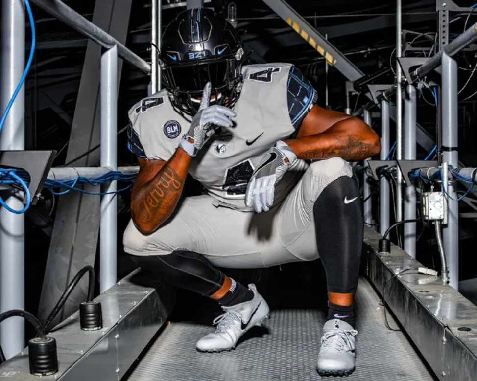
Terry, PLEASE bring back pewter. Seriously, we see you wearing pewter UCF gear all the time… Talk about mixed messages! I know folks are either all in or all out on the pewter look, but I absolutely love it. Include it as part of the Space Game and you’ve got a perfect combination. The reflective UCF stack on a dark helmet is awesome. Probably the one and only time we’ll see pewter used for the Space Game.
Mission III 2019
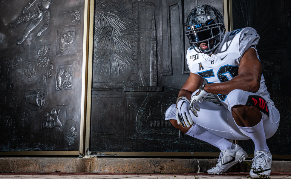
This is probably a hot take, but the moon helmets are a sore spot for me. In theory, they are VERY cool. In execution, for a football helmet, it just wasn’t for me. I’m a perfectionist. I need SYMMETRY in my life. It looks unbalanced from the front and back. Plus, you can’t see the UCF stack on the “dark” side. If we’re really worried about people recognizing UCF’s brand, let’s not confuse folks by hiding the UCF stack. The jersey and pants were excellent. The retro “USA” rocket design on the leg was a nice touch.
Mission V 2021
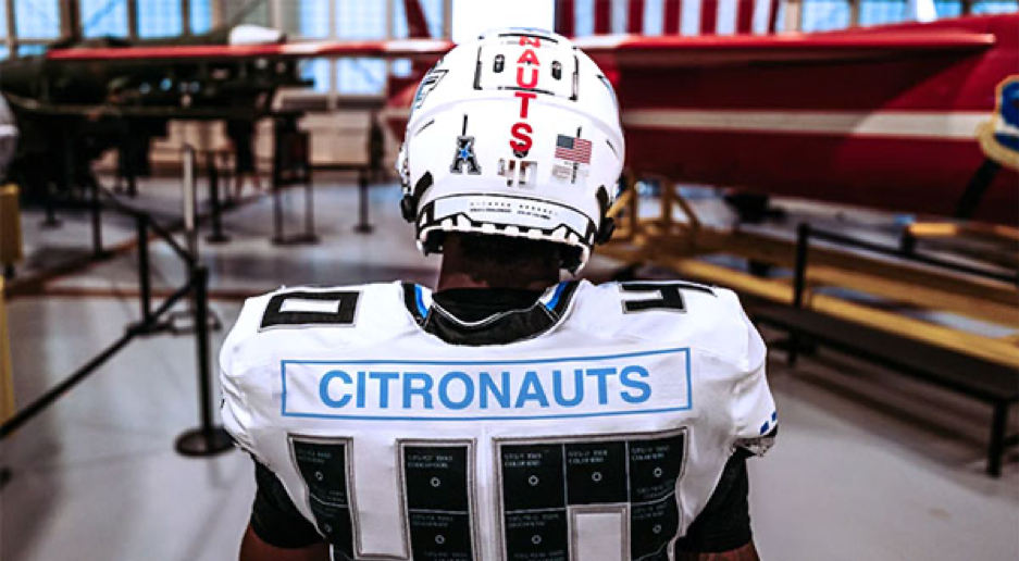
A clean, white UCF jersey designed to commemorate the Space Shuttle program? Are you kidding me!? Does it get any better?? The “Discovery” name on the sleeve, designed to mirror the Space Shuttle of the same name. The helmet stripe, made up of names of UCF folks who worked on the Space Shuttle program. The jersey numbers, themed after the shuttle’s thermal panels with unique shuttle missions listed in them. The attention to detail is unreal.
Mission II 2018
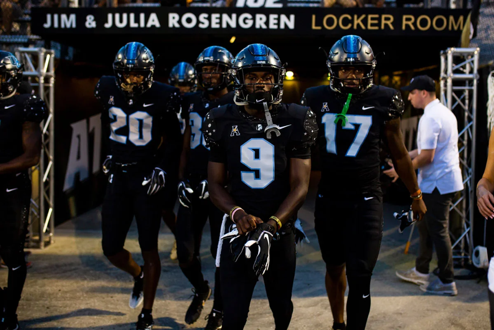
The top spot must go to the (in my opinion) “classic” Space Game uniform. It wasn’t the “first” but it was the first truly space-themed uniform that UCF designed from the ground up, for the annual space game. The all-black uniforms with the constellation pattern on the shoulders and helmet alongside the Canaveral blue accented numbers absolutely blew my mind the first time I saw it. It’s the first time we got to see the Citronaut head logo on a UCF football jersey.

0 Comments